Composition on Modernizing Page Designs for Better Usability
by Shihab Hasin, UX Designer
Every day, users make split second decisions. They decide whether to stay or leave. Whether to click or scroll. Whether to trust or bounce. These decisions happen before they read a single word of content.
The difference between a user staying or leaving is often invisible to the naked eye. It is not about flashy animations or trendy gradients. It is about structure. A well composed layout guides the user without them realizing it. A poor layout feels frustrating, but users rarely know why. They just close the tab.
As a UX Designer, I have seen the same mistakes repeated across countless products. Modals that trap users. Spacing that feels cramped. Primary actions buried under secondary clutter. Color schemes that scream at nothing in particular. These problems are solvable. They do not require new technology or massive budgets. They require disciplined composition.
This topic presents 8 practical rules for modernizing page designs. Each rule solves a specific problem. Each rule includes real world examples you have likely encountered yourself. None of these rules are theoretical. They come from years of watching users struggle, succeed, and occasionally curse at their screens.
Before a user clicks, they see a layout. Good layout makes the click easy. Bad layout confuses people. Here is how to modernize page designs using practical, measurable methods.
1. Scaffold: The 9 Grid System
The problem: Designers often jump straight into detailed layout grids like 12 or 24 columns. But before arranging content, the overall composition needs a macro structure. Without this, pages lack visual hierarchy. Elements compete for attention. The user’s eye has no clear entry point or resting place.
The fix: Start with a 3×3 grid overlay. Divide the canvas into 3 equal columns and 3 equal rows. This creates 9 intersecting points. Place key visual elements along these lines or at their intersections.
Why it works: The 3×3 grid (Rule of Thirds) is borrowed from photography and painting. The human eye naturally gravitates to the four intersection points. Placing primary content here creates balanced, dynamic compositions.
Real world examples:
- Hero section composition. The main headline sits on the top left intersection (1/3 down, 1/3 in). The primary CTA button sits on the bottom left intersection (2/3 down, 1/3 in). A product mockup sits on the right two thirds. The user sees the headline, then the button, then the product in a natural Z pattern.
- Login or signup modal. The modal box itself occupies the center third column and center third row. The “Log In” button sits at the bottom right intersection. The “Forgot Password” link sits at the bottom left intersection. The eye lands on the form, then moves to the primary action, then finds the secondary link without searching.
- Image gallery or portfolio. The hero image has the main subject placed exactly at the top left intersection. Supporting images occupy the bottom right quadrant. The viewer’s eye moves from the hero subject across the grid to the supporting work. No cropping feels accidental. Every image feels intentionally framed.
2. Guide: Points of Interest (POIs)
The problem: Users do not read. They scan. If nothing catches their eye within two seconds, they leave. The human eye needs visual anchors to know where to look first. Without deliberate placement of key elements, users wander aimlessly across the page. A page without clear POIs is like a city without street signs.
The fix: Identify three POIs. Primary, secondary, tertiary.
Placement rules:
- Primary POI (main CTA or headline) goes at the rule of thirds intersection.
- Secondary POIs follow the natural top left to bottom right eye path.
Real world examples:
- Landing page for a project management tool. Primary POI is the “Start Free Trial” button. Secondary POIs are three feature icons just below it. Tertiary POI is a customer testimonial video in the bottom right.
- Checkout page. Primary POI is the large “Pay Now” button. Secondary POIs are the payment method icons (Visa, PayPal). Tertiary POI is the “Apply Coupon” link placed near the subtotal.
- News article. Primary POI is the headline. Secondary POI is the lead image. Tertiary POI is the “Subscribe” button in the margin. The user sees the headline first, then the image, then the offer without feeling forced.
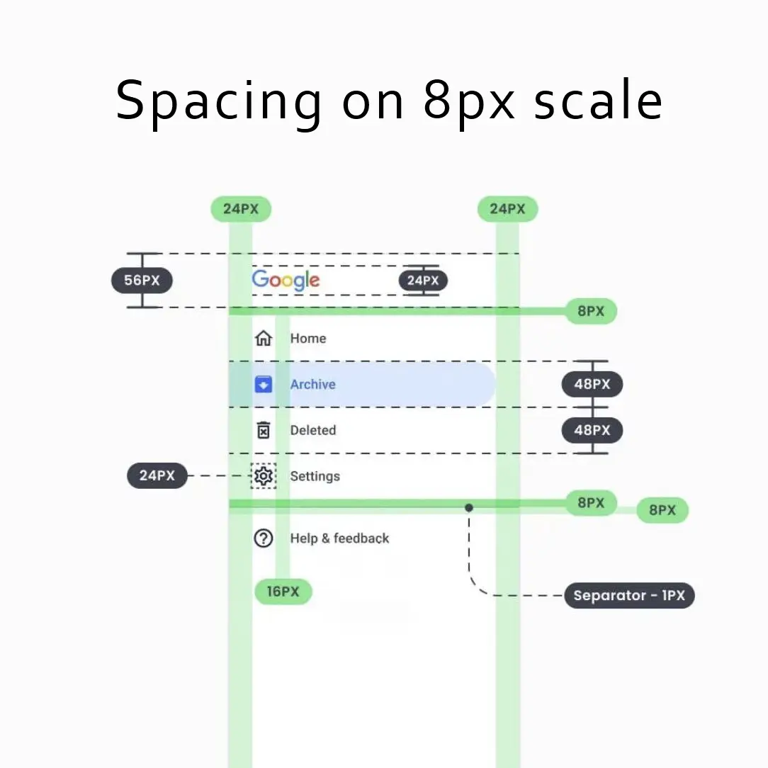
3. Breathe: 8px Multiplication for Spacing
The problem: Inconsistent spacing makes interfaces feel cheap and untrustworthy. Margins of 5px, 7px, 12px, and 18px on the same page create visual chaos. Users subconsciously register the lack of rhythm as sloppiness. When spacing has no system, everything feels broken even if the functionality works perfectly.
The fix: Use only multiples of 8 for spacing, margins, and padding.
The scale: 8, 16, 24, 32, 48, 64, 96 pixels.
Why 8: Browser default is 16px (2 x 8). Screens render multiples of 4 cleanly.
Real world examples:
- Form design: Labels sit 8px above input fields. Input fields are 16px apart vertically. Section breaks use 48px. The form feels organized without feeling cramped.
- Card grid: Each card has 16px padding inside. Cards are 24px apart from each other. The outermost container uses 32px padding from the browser edge. Everything aligns vertically across breakpoints.
- Mobile menu: Touch targets (icons and labels) use 48px minimum height. Menu items have 16px vertical spacing. The hamburger icon has 8px padding around it. No accidental taps. No crowded lists.
4. Color Balance: The 60-30-10 Rule
The problem: Too many colors create noise where nothing stands out. Designers often use five or six colors because the brand palette offers them. The result is a rainbow where every element fights for attention. Users cannot distinguish between a primary button and a decorative icon. When everything is highlighted, nothing is highlighted.
The fix: Follow the 60-30-10 distribution.
60% Neutral: Backgrounds and main panels. Example: #F9FAFB to #FFFFFF.
30% Secondary: Cards, headers, footers. Example: #F3F4F6 with subtle borders.
10% Accent: Buttons, links, active states. Example: brand blue #3B82F6.
Real world examples:
- Banking dashboard. Background is white (60%). Account summary cards are light gray (30%). The “Transfer Money” button and notification badges are the bank’s signature green (10%). Users never miss a call to action.
- Music streaming app. Now playing screen uses a dark neutral background (60%). Album artwork and track list cards use a slightly lighter dark gray (30%). Play, pause, and heart icons use the brand’s bright pink (10%). The controls jump off the screen.
- Analytics report. Charts sit on a white background (60%). Legend and axis labels use medium gray (30%). The primary data line and key metric badges use a bold purple (10%). Stakeholders find the most important number instantly.
5. Contrast: Visual Priority and Distinction
The problem: Even with good color balance, UI elements can blend together. A button might look like a card. A link might look like regular text. A danger action might look the same as a safe action. Users hesitate because they cannot quickly tell what is clickable, what is readable, and what is actionable. Low contrast between element types creates confusion and slows down every interaction.
The fix: Establish clear contrast rules for different UI categories. Use multiple contrast levers: color, weight, size, shape, and spacing. Buttons should never look like plain text. Destructive actions should never share the same color as primary actions. Backgrounds, cards, and interactive elements each need a distinct visual signature.
Contrast levers to use:
- Color contrast: Danger actions use red. Primary actions use brand color. Neutral text uses gray, not black.
- Weight contrast: Headlines are bold. Body text is regular. Links are medium weight.
- Shape contrast: Buttons have rounded corners. Cards have subtle borders. Input fields have underlines or light backgrounds.
- Spacing contrast: Surround important elements with more negative space.
Real world examples:
- Primary vs secondary button on a checkout page: The “Complete Purchase” button is solid blue with white text, 48px tall, bold font. The “Continue Shopping” link is plain text with an underline on hover only. No user ever confuses the two. The primary action dominates visually. The secondary action exists but does not compete.
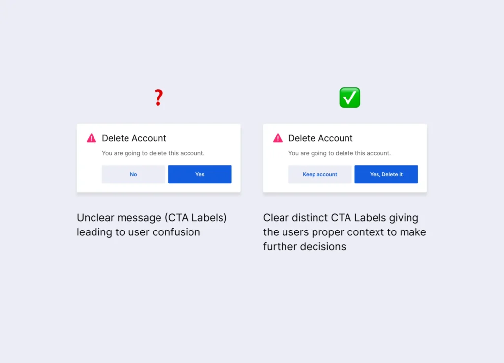
- Danger zone in account settings: Delete account is not a blue button. It is a red outlined button with a warning icon. The text says “Permanently Delete Account” in red. A confirmation modal appears before any action. Users see red and pause. That pause prevents accidental data loss.
- Form field labels vs placeholder text: The label is bold dark gray, 14px, positioned above the field. The placeholder text inside the field is light gray, 12px, italic. Users can scan the form by reading labels only. The placeholder is clearly secondary. No one mistakes a placeholder for a pre-filled answer.
- Notification badges vs regular icons: A regular inbox icon is thin line art, gray. An unread badge adds a solid red circle with white number inside, positioned at the top right corner of the icon. The contrast between gray line art and red solid dot is unmistakable. Users see the badge without searching.
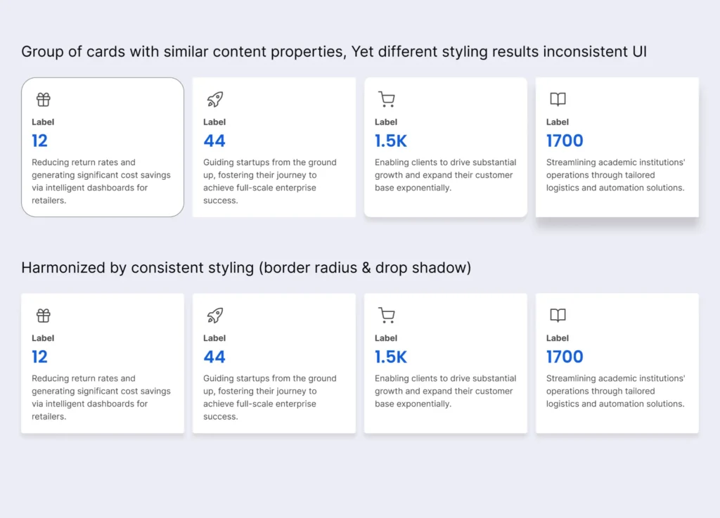
6. Harmonize: Grouping and Generalization
The problem: UI junk drawer syndrome happens when every new feature brings a new component style. Buttons have different corner radii across the same page. Cards use inconsistent shadows. Dropdown menus appear in three different colors. Users must relearn the interface every time they encounter a new section. This cognitive friction adds up quickly.
The fix: Group related items. Generalize identical functions.
Real world examples:
- Email inbox interface: All action buttons (Archive, Delete, Mark as Read) live together in a single toolbar above the message list. They use identical height, padding, and hover states. A new user learns the toolbar once.
- Calendar app: Every event card uses the same white background, 8px border radius, and subtle shadow. Only the left border changes color (blue for meetings, green for personal, red for deadlines). Users scan by color but trust the consistent card shape.
- File manager: All file row items have the same three dot menu on hover. The menu always contains Rename, Move, Duplicate, and Delete in that exact order. Users memorize the menu position without reading labels every time.
7. Hide Secondary Options: Progressive Disclosure
The problem: Showing every possible action at once overwhelms users with choice paralysis. A single row of ten buttons forces the brain to evaluate each option before acting. Secondary actions like Duplicate or Archive distract from primary tasks like Save or Submit. Users abandon pages that feel too complex, even if the complexity is just visual noise.
The fix: Show primary options by default. Hide secondary options behind clicks or hovers. Keep them easily accessible but out of the way.
How to implement:
- Use three dot menus for edit, duplicate, and delete actions
- Show advanced filters only after clicking “More Filters”
- Reveal secondary buttons on hover, not permanently
- Group rarely used settings under an “Advanced” expandable section
Real world examples:
- Task management app: Each task shows a checkbox (complete) and a text title. On hover, three small icons appear: Edit, Duplicate, Add Due Date. No permanent clutter. Users who need the extra options find them instantly. Users who just want to check off tasks see nothing distracting.
- Photo editing tool: Main toolbar shows Crop, Adjust, and Filters. A small “…” button hides Rotate, Flip, Straighten, and Export as PNG. Ninety percent of users only need crop and filters. Advanced users click once to access everything else.
- Ecommerce product page: Primary options are Size dropdown, Quantity selector, and Add to Cart. Below a “More Options” expandable section hides Gift Wrap, Schedule Delivery, Add Insurance, and Write a Note. The main page stays clean. Buyers who need special options expand one section to find them.
- Settings panel: Top level shows Profile, Notifications, and Billing. An “Advanced” section at the bottom hides API Keys, Export Data, and Danger Zone (Delete Account). Casual users never see scary options. Power users find everything in one predictable place.
8. Removing Dark Patterns
The problem: Dark patterns trick users into doing things they do not mean to do. A pre checked box signs them up for weekly emails. A tiny grey “Cancel” link hides in the corner while a bright “Keep Subscription” button dominates the modal. Users feel manipulated and betrayed when they realize what happened. This betrayal destroys brand trust permanently, often after a single interaction.
The fix: Remove every trick. Make all choices honest and visible.
Real world examples:
- Newsletter signup modal. There is no pre checked box. Two buttons sit side by side. “Subscribe” is a filled button. “No thanks” is an outlined button with equal size and same font weight. The user chooses freely.
- Subscription cancellation flow. Step one shows a list of benefits the user will lose. Step two requires typing “CANCEL” into a text field. Step three has a large red “Permanently Cancel” button. No hidden links. No “Are you sure?” loops.
- Cookie consent banner. “Reject All” sits right next to “Accept All”. Both use the same button style. “Customize” is a text link below. The user does not have to hunt for the option to say no.